Better design Better results
Lister Buildings— the next step in efficient and sustainable building
Acknowledge— a fresh new brand for an ict service company
Stratego— an advertising agency specialized in branding
Artiteq— a website for flexible picture hanging systems
Handyfloor— a magento webshop for vinyl floors
Judex— a webportal for legal information and representation

Judex

a webportal for legal information and representation

Judex is a portal for legal articles, videos, documents and tips. The website not only combines over 800 pages of content, it also offers an online meeting place for law offices.

Lawyers and attorneys alike can filter on work fields, location and experience. Judex aims to provide visitors with an online oracle of legal information.

  • Deliverables Branding UX & Visual design
  • Project Brand WordPress website
  • Year2017

The challenge

Visitors come to Judex for legal aid. The website is completely designed to help users quickly navigate their way through the abundance of information. The design is modern and sleek, but also has that classic courthouse look and feel. Law offices will feel right at home.

The project

The impressive amount of content Judex offers on the homepage is presented in a straightforward and clean design. This fresh and elegant look is carried out through the entire web portal. Judex’s visitors will always the right information, every time.

  • Droid Sans

    — Serif fonts provide an instant classic appearance. The luxury Droid Serif was used for the titles, giving the website a unique personality.

  • Open Sans regular

    — Open Sans Regular pairs flawlessly with the title font. This standard font provides the necessary modern touch, making the website easy to read.

  • Open Sans semibold

    — Another font from the Open Sans family, Semibold is mainly used as a secondary header. These can be found throughout the web portal in capitalized letters.

Style choices — crafting the right feeling

Judex requested a fitting classic design. They really wanted to capture that typical law office style. Combining this with a sleek modern feel creates a web portal that speaks to the audience, but is still contemporary and easy to use.

The purple colour really mirrors the characteristic side of the design. A bright orange colour provides the perfect contrast, allowing call to actions and other buttons to truly stand out for the user.

  • #656684
  • #F28320

Sitemap and user flow

Judex’s web portal offers users an impressive amount of content. No matter the question, visitors will find their answer. The clever sitemap allows users to easily navigate their way through the abundance of information.

Sitemap & userflow

The homepage — focus and attention

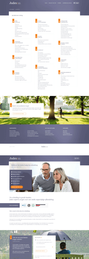
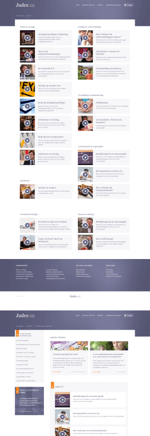
The Judex web portal homepage collects over 800 tips, videos, articles and legal documents in twelve different subjects. Users should be able to instantly find the subject they’re after.

Judex offers people the opportunity to directly contact a lawyer for legal aid. Using a recognizable button on the homepage, visitors can easily find the answer to their legal questions.
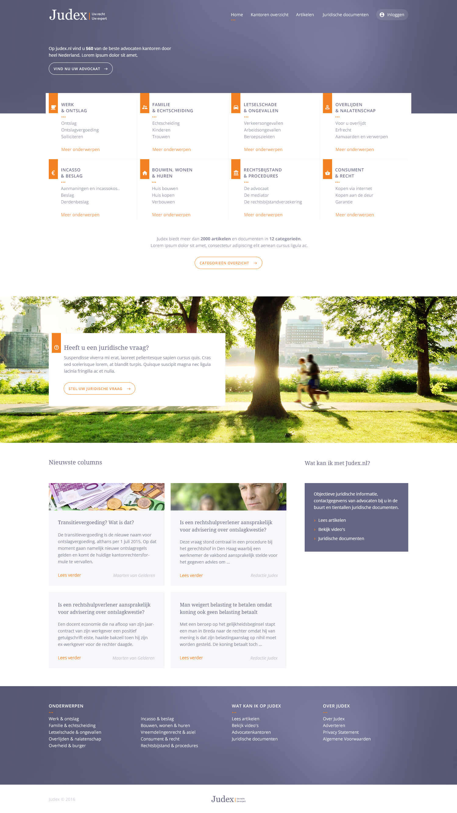
Judex homepage
Judex mobile

Mobile accessibility

Users have access to legal aid whenever they want, wherever they want. The Judex web portal is easily accessible through mobile devices.

The homepage of the mobile design still focusses on the legal subjects and allows visitors to request aid from a legal counsellor at any time.

Legal offices — finding the spotlight

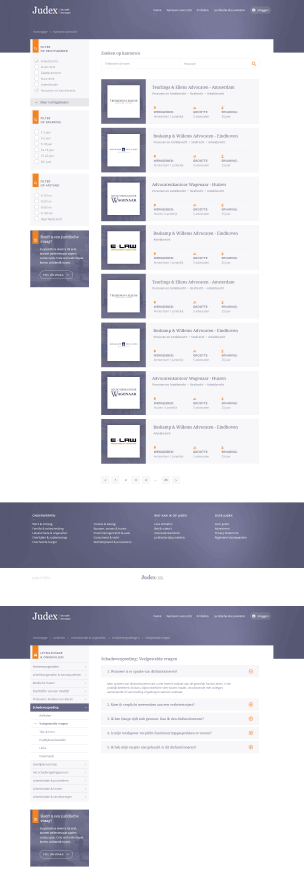
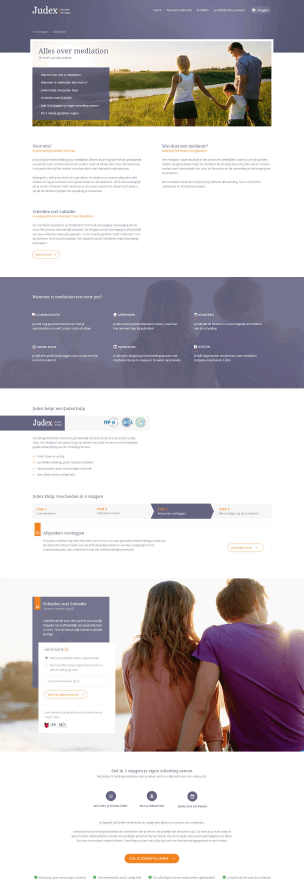
Judex offers a stage for every law office that provides their contact details. Visitors can search through dozens of offices to find the best lawyer for their case. Luckily, this process is made a whole lot easier with the filter option.

Each law office gets their very own profile page where they can provide information, for instance about their specialties, achievements or employees. They can also offer visitors the chance to contact them.

Consistent styling — multiple types of content

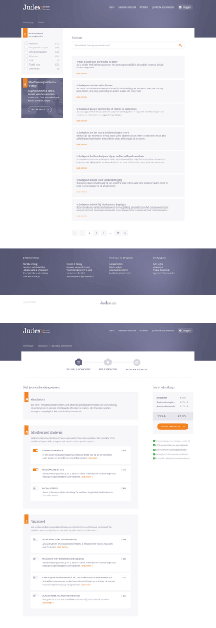
Combining more than 800 articles, documents and videos on one website poses a huge challenge for the design. Every single page needs to be in style, recognizable and still easy to read.

The design includes article pages, video formats, overviews and endless landing pages with valuable content. The classic yet modern style is apparent on every single page.

Marijn has the skill to combine a strong design with powerful UX. His designs do not only look good, but also work well. He’s customer focused, has knowledge of technical implementations and is very reliable. A great designer to work with!

Michiel HoubenCo-founder / Managing director at Greenhouse Group